
Prepared by: M. Sharifa Fahd – One of the problems we often face when redecorating our homes or updating our furniture is choosing colors that are in style and coordinating them Colors in an attractive and elegant way. Here are the steps to help you format Decor Colors Make decorating your home easy.
Start by choosing a floor color
The floor is the fixed element in your home—its color never changes—and it occupies the largest visible area, so that’s where you should start. For example, if you have brown parquet flooring, you’ll need a light shade that complements it and softens the intensity of the brown in the floor. You can choose a shade of beige or a very light blue, The key is that it should complement the brown. In this case, follow this rule: the dominant color should be 60%, the secondary color 30%, and the accent color 10%, meaning that the wall color is the dominant color, the color of the rug or furniture is the secondary color, and the complementary color is the color of the pillows, lampshades, and accessories—preferably a bright, vibrant shade. We coordinate colors as they appear in nature: a dark color for the floor, a lighter color for the walls, and a very light color for the ceiling.
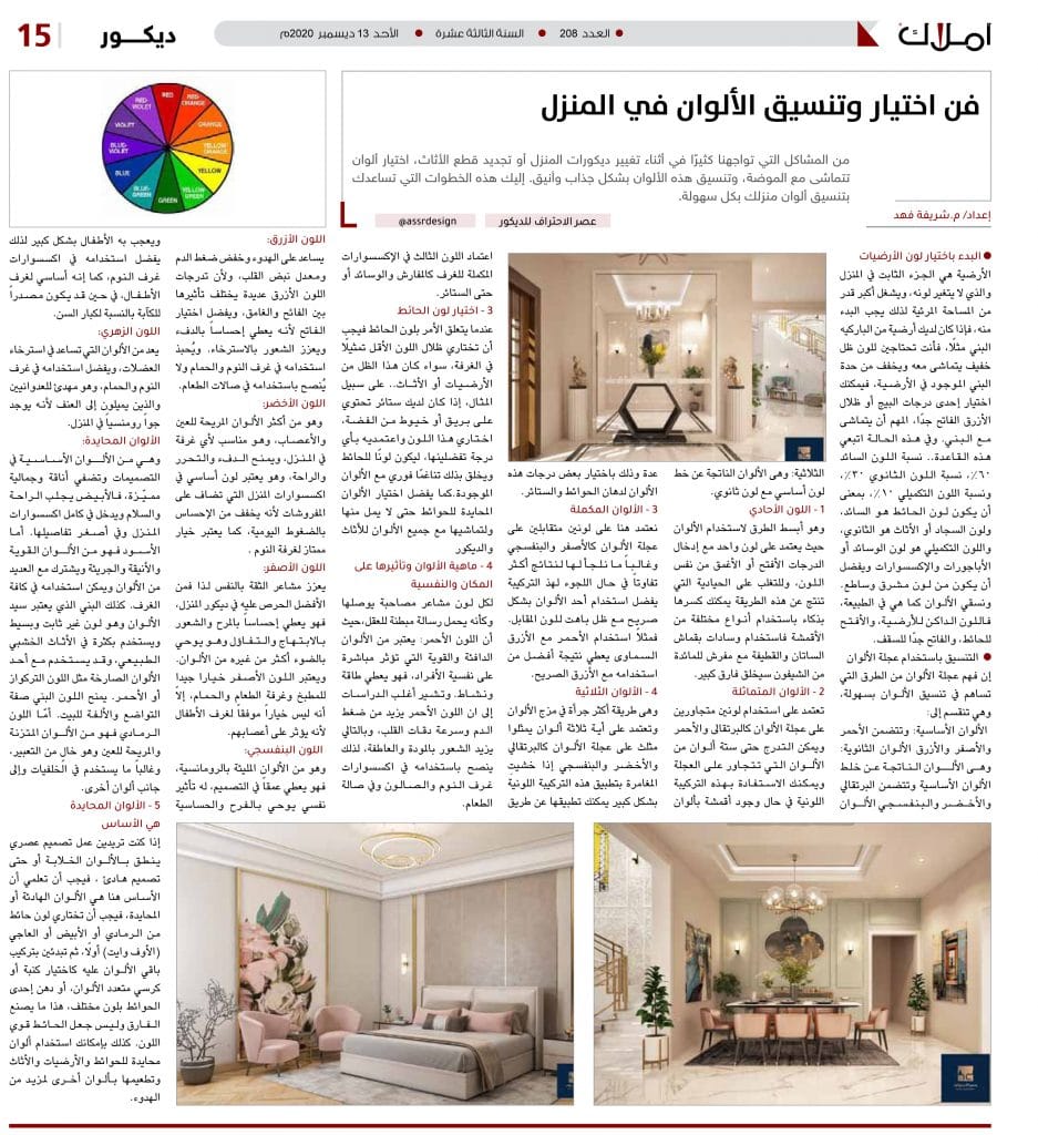
Coordinating Home Decor Using the Color Wheel
Understanding the color wheel is one way to easily coordinate colors. It is divided into:
Primary colors: These include red, yellow, and blue. Secondary colors: These are colors created by mixing primary colors and include orange, green, and purple. Tertiary colors: These are colors created by mixing a primary color with a secondary color.
1 – Monochromatic Color
This is the simplest way to use color, as it relies on a single color with lighter or darker shades of that same color. To overcome the neutrality that results from this method, you can cleverly break it up by using different types of fabrics; for example, using satin and velvet cushions with a chiffon tablecloth will make a big difference.
2 – Analogous Colors
This scheme relies on using two adjacent colors on the color wheel, such as orange and red. You can create a gradient using up to six adjacent colors on the wheel. You can take advantage of this color combination when working with fabrics in multiple colors by selecting certain shadesof these shades for painting walls and curtains.
3 – Complementary Colors
Here we rely on two colors opposite each other on the color wheel, such as yellow and violet, and we often use this combination to achieve more contrasting results. When using this combination, it’s best to use one color boldly with a muted shade of its opposite. For example, using red with sky blue yields a better result than using it with pure blue.
4 – Triadic Colors
This is a bolder approach to mixing colors and relies on any three colors that form a triangle on the color wheel, such as orange, green, and purple. If you’re hesitant to take a big risk with this color combination, you can apply it by using the third color in room accessories such as tablecloths, pillows, or even curtains.
3 – Choosing a Wall Color
When it comes to wall color, you should choose the shade that’s least represented in the room, whether that shade comes from the flooring or the furniture. For example, if you have curtains with silver sparkles or threads, choose that color and use it in whatever shade you prefer for the walls, creating instant harmony with the existing colors.It’s also best to choose neutral colors for the walls so you don’t get tired of them and so they go well with all the colors of your furniture and decor
4 – What Colors Are and Their Effect on Space and Psychology
Every color conveys certain emotions, as if it carries a subtle message to the mind. Red, for example, is considered a warm and powerful color that directly affects people’s psychology; it instills energy and vitality. Most studies indicate that red increases blood pressure and heart rate, thereby heightening feelings of affection and emotion; therefore, it is recommended for use in bedroom and living room accessories, as well as in the dining room.
Blue:
It promotes calmness and lowers blood pressure and heart rate. Because there are many shades of blue, their effects vary between light and dark tones, it is best to choose light shades because they provide a sense of warmth and promote relaxation. It is recommended for use in bedrooms and bathrooms but is not recommended for dining rooms.
Green:
It is one of the most soothing colors for the eyes and nerves, It is suitable for any room in the house, providing warmth, freedom, and comfort. It is considered an essential color for home accessories added to furnishings because it alleviates the feeling of daily stress, and it is also an excellent choice for the bedroom.
Yellow:
It boosts self-confidence, so it’s best to incorporate it into your home décor. It conveys a sense of fun, joy, and optimism, and it evokes light more than any other color. Yellow is a good choice for the kitchen, dining room, and bathroom, but it is not a suitable choice for children’s rooms because it can affect their nerves.
Purple:
It is a color full of romance; it adds depth to a design and has a psychological effect that evokes joy and sensitivity. Children love it, so it’s best used for bedroom accessories, and is essential for children’s rooms, though it may be a source of melancholy for older adults.
Pink:
It is one of the colors that help relax muscles, and is best used in bedrooms and bathrooms. It has a calming effect on aggressive people and those prone to violence because it creates a romantic atmosphere in the home.
Neutral colors:
These are essential colors in design and lend a distinctive elegance and beauty to home decor; white brings comfort and peace and is incorporated into all home accessories, down to the smallest details. Black, on the other hand, is a strong, elegant, and bold color that pairs well with many other colors and can be used in all rooms. Brown, considered the "master of colors," is a versatile and simple shade frequently used in natural wood furniture; it can be paired with bold colors such as turquoise or red. Brown lends a sense of modesty and warmth to the home. Gray, on the other hand, is a balanced color that is easy on the eyes; it is neutral and is often used for backgrounds or in combination with other colors.
5 – Neutral Colors Are the Foundation
If you want to create a modern design that features stunning colors or even a calm design, you should know that the foundation here is calm or neutral colors, You should first choose a wall color like gray, white, or off-white, then start incorporating the rest of the colors—such as a multicolored sofa or chair, or painting one wall a different color. That’s what makes the difference—not painting a wall a bold color. You can also use neutral colors for the walls, floors, and furniture and accent them with other colors for a more serene look.