Melaf Alromi
@MelafAlromi
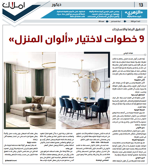
Choosing <a style="color: #993300;" href="https://amlak.net., choosing furniture for the room is an important step that you should pay attention to, because it constitutes a great psychological impact, choosing harmonious colors of paint, decor and others creates a psychological balance, and reflects on it a positive feeling that helps to achieve satisfaction and relaxation, and to achieve this, you can follow a number of tips.
Consider nature
Official Zones
Dedicate your efforts to formal rooms, such as living and dining rooms and entryways, choose primary colors for these areas first and then use a color or shades of it for the rest of the rooms.
Select primary colors for these areas first and then use a color or shades of it for the rest of the rooms.
The color wheel
The color wheel contains several patterns that illustrate the relationships between different colors, and makes it easier to choose colors based on these combinations, such as choosing a monochromatic set, and going from light to dark tones.
Color Combination
Try to combine warm and cool colors together to give the space a freshness and vitality, such as using two different colors in the same room.
Try to combine warm and cool colors together to give the space a freshness and vitality.
Room specificity
Take into account the type of room, its area and the number of windows, living rooms should be calm and simple colors, bedrooms should be comforting colors, and dining rooms are common and social rooms, so their colors should be bright and sociable.
Vertical Gradient
.This method relies on the floor being dark, then moving up vertically to the walls and furniture, to contain medium tones that are lighter than dark, and then to the ceiling where they are lighter.
Vertical Gradient.
Rule 10% - 30% - 60%
When starting to choose colors for a space, divide the colors into 3 sections, the first takes 60% of the space such as walls and is the dominant color, the second 30% such as curtains and sofa, and the last 10% which is the accent color.
Rule 10% is the side color.
Light reflection
A light color reflects 50-80% of light into the room and makes the space look bigger than it actually is, and vice versa, a dark wall paint reflects 5-30% and makes the space look smaller.When choosing a color, we must take into account the light and its reflection.
one color
Distinguish one place such as painting the high ceiling with a dark color that affects the place and gives it a warm character, while the low ceiling is suitable for a light color so that it seems higher than it is, and in some spacious rooms one wall can be painted in one distinctive color, and sometimes the lower part of the wall can be painted to give it less height.
Color connotations
Some may choose colors according to their color connotations such as green indicates relaxation and blue indicates calmness as said in color psychology, but these colors may not apply according to a person's desires and convictions.